Case Study
IDENTITY. BRANDING. WEBSITE.
FKSP

FKSP is a new clothing line by online fashion blogger, Folake Kuye. Folake has turned a wildly successful blog, StylePantry.com, into an indispensable fashion resource and community over the last decade, and with FKSP now focuses on delivering stylish, accessible, budget-friendly pieces for the every day woman.
Designer
Illustrator
Identity
Finding the right name
Sometimes the best decision is the simplest. Don’t overcomplicate things.
We poured over names for weeks trying to figure out what to name the new company before realizing it had been staring at us the entire time.
“FK” is for Folake Kuye, and “SP” for Style Pantry. Folake has such a unique name, and she is so rooted in her Yoruba culture; it didn’t seem right to not have it as the cornerstone of the name. And equally important is Style Pantry, the moniker by which she’s known in the online fashion scene.
No other name would suffice. Everything else fell short, and FKSP was born.

Branding
Making a Mark
Finding balance isn’t always easy.
The letters F, K, S, and P aren’t the best bedfellows when placed next to each other in sequence. There are some empty spaces between the letters that are only exacerbated when you stick a line of text underneath and box the whole logo mark. It didn’t make sense lining the text underneath with the outer edge of the P’s bowl, yet aligning it with the right edge of the P’s foot serif left a big space in the lower right corner of the mark.
I worked hard on the kerning between the letters, and on the padding between the letters and the box, and settled on a design that breathes well and checks all the boxes. The key to making this logo mark work as a whole was finding the rhythm in the letterforms, while also giving “FK” and “SP” a subtle separation. While I wanted to get rid of “FOLAKE KUYE | STYLE PANTRY” underneath the feet of FKSP, in the end we decided it had to stay.
While it might seem a little cumbersome at times, we had to remember that many won’t know FKSP means “Folake Kuye, Style Pantry.” She just doesn’t have the ubiquity and recognition of Coco Chanel or Donna Karan—the founders of the iconic CC and DK logos and brands—yet.
From a usability standpoint, we have to lose the text underneath FKSP on smaller sizes. Under about 200 pixels wide, the words become a jumbled mess, so we use the logo plain without the descriptor. In any case, the plan is to only keep them as a crutch for the first few years, and then jettison them once FKSP has a stronger marketshare.

Classic Fashion Colors
It’s hard to go wrong with black and white.
 |
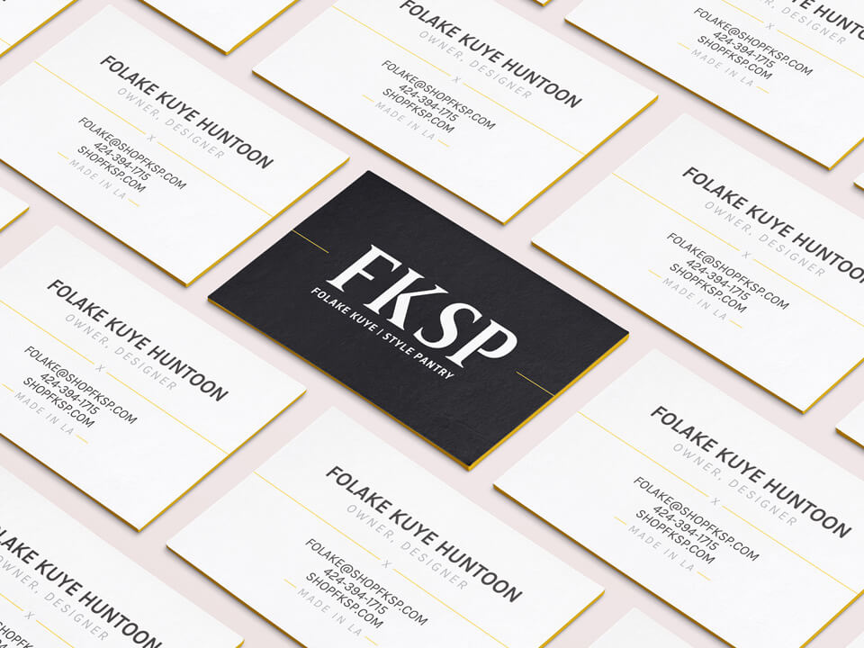
Gotta love it when the client says, “I just want it black and white to keep everything feeling classic and chic. I want the clothes to be the ‘colors’ in this brand.” That said, fewer colors doesn’t make designing any easier, and some people might tell you it makes it harder (it really might be). It only means the selection process is a bit shorter, as you don’t have to try 1000 color combos to make sure they all harmonize. As the additional color, we chose a rich gold to lend a premium feel: black, white, goldenrod, and grey (to help balance, especially on the website and in the newsletter). The result is a simple system that feels timeless and really lets the products and photography shine as they should. |



Website
We love you, Shopify!
Let your software work for you. You don’t need to reinvent the wheel.
Shopify has been an absolute godsend for Folake and her clothing lines. It has allowed her to get up and running quickly with each of the clothing businesses she’s run over the last 10 years.
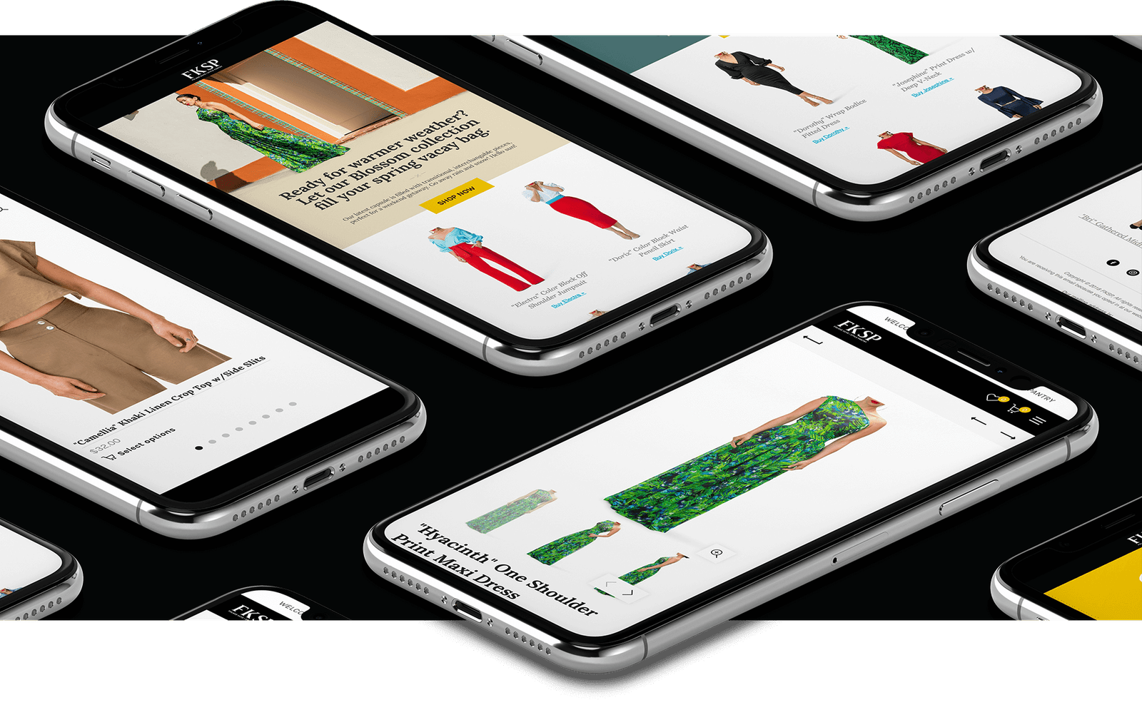
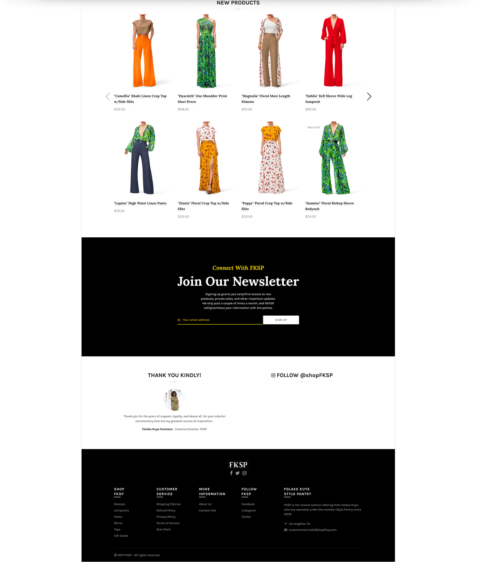
With ShopFKSP.com, we worked hard to get out of the way of the clothing. We pared down our design as much as possible, so that the clothes had little standing between them and the customer. While there are little embellishments here and there, this site design was an exercise in restraint.
The final product is as Folake envisioned it. The site falls into the background and allows the model, the vibrant prints, and striking colors to scream off the page. Whether on a desktop, tablet, or phone, the products reign supreme.
We rarely, if ever, get any questions about how to use the site or where to find something. Everything is well organized inside an intuitive interface, allowing an enjoyable user experience for every customer.

Credits
Client Partner